 Heronmark
I went through and hand-made more of the graphics for buildings and upgrades.
Got rid of the farm houses snd logging huts. When you zoomed out especially, a realm with lots of these looked like a sprawling city. Now the farms are just a field and the logging camps are some cut down trees and logs. It looks more organic.
Also added a little more depth to the drawing sod the buildings with simple shading and multiple sides to the buildings visible. It’s not a masterpiece but it feels much more enjoyable to look at and interact with.
The biggest change was to the fonts, icons, and menus. Thanks to game-icons.net, I was able to swap out the old web icons to make it really feel a lot more like a CIV or Total War game. There are also some nice framing and accents added to make it feel more period-appropriate.
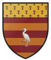
House Arms also show up most places a realm is named so you can start to immediately identify those realms if you’re a more visual person like me.
The borders now sit behind the buildings and objects on the map, so it’s like your overlay of your realm sits on top of the ground but under anything above the ground. Makes the whole thing feel less flattened out.
I explored more of a pixel art and isometric view, but chose not to go there yet. Partly because I didn’t think it looked much better AND majorly because it slows down performance, which I want to always optimize for so the game is easy to play when there’s massive realms on screen. I may still do something different with this in the future and add LOD (level of detail) so close up looks cool and far away is more icons, but for now this is already an improvement.
Thanks for the feedback on this being important! Reddit and a few of you playing gave that feedback quickly, so I prioritized hustling to get something shipped.